Responsive Website – What It Is and How Important it is?
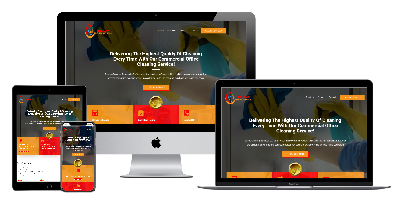
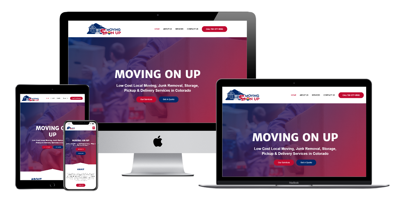
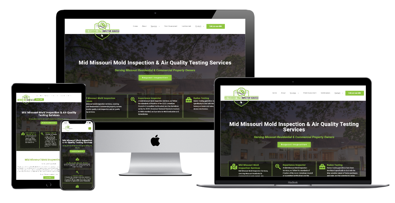
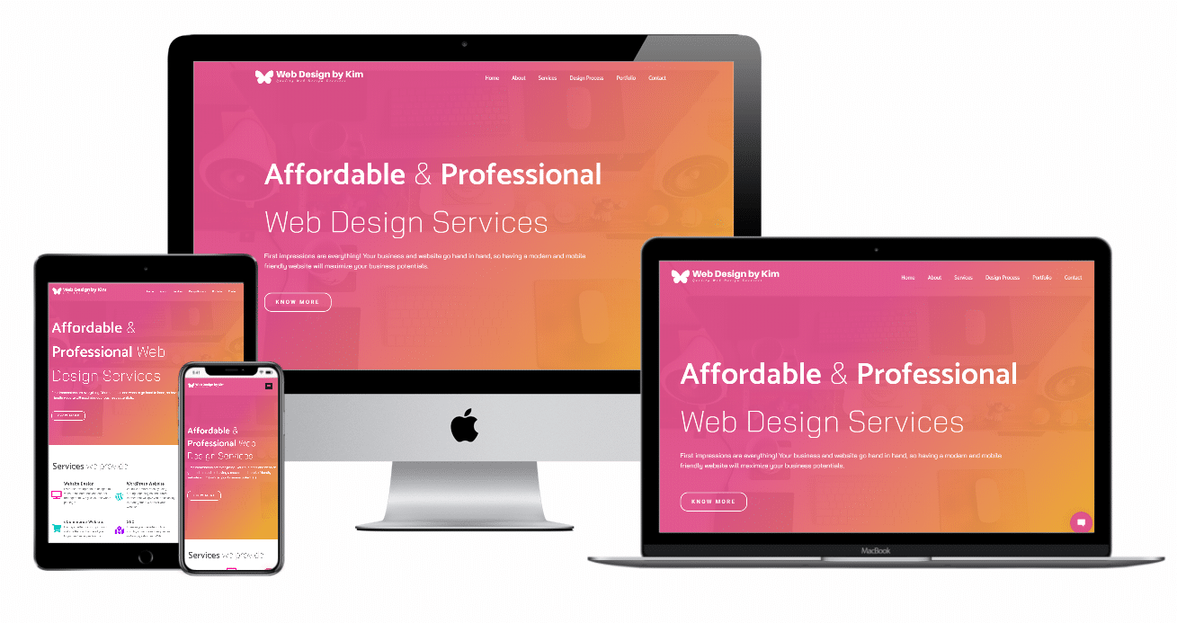
Responsive Website Design is a web development approach that makes your website pages respond or display well on multiple devices or screen sizes (desktop, iPad, Phone). In responsive design, page elements changes and the images are flexible to fit the screen size of the device being used to view your website.
Having a Responsive website is important because majority of people browse websites using tablet or mobile devices. Giving them the best user experience is helpful for businesses that rely on their website for sales. Also, Google is ranking responsive websites higher versus those are not mobile friendly.
Your website should be responsive or render well to all devices so it will be faster to load, easy to navigate and read. It’s a necessity for your users to fill out forms easily and without issue on their mobile devices since your website is a powerful tool in generating leads for your business.
How to Tell if Your Website is Reponsive?
There are many free tools or websites that can help you test if you have a responsive website and to see your website on different device resolutions.
Here are the following website mobile friendly tester:
Do you need help building or redesigning a modern and responsive website?
Contact Me for a Website Consultation or Get a Website Design Quote.